The design system behind Relay, moved from Figma into code. Components live in Storybook with every state, Claude Code reads the system through Figma MCP and a set of skills, and a design reaches developers as a working prototype instead of a static frame.
Under NDA. Brand and screens are redrawn.
In progress: rolling out now
Role
Sole product designer
Year
2026 – now
Tools
Figma, Storybook, Claude Code
Status
In progress
Overview
Relay's designs used to reach developers as flat Figma frames. I moved the work into code: a component library documented in Storybook with all of its states, and a Claude Code workflow on top of it. A design now arrives in development as a prototype you can click through, states included. On the team I'm the only designer, working with a product owner, an analyst, an architect and frontend and backend developers.
It changed how I work, too. Where I used to defend a decision with a frame, I now try it out in a prototype built from the same components the product runs on.
The problem
Managers use Relay to build segments, triggers, campaigns and journeys, and most mistakes hide in states rather than layouts: a trigger that is paused while its schedule says active, a campaign that could fire twice, a segment caught mid-recalculation. A frame can't show any of that. The behaviour sat in comments, developers guessed the gaps, and mockups leaned on parts the library didn't have.
The tools changed as well. With AI, a clickable prototype takes about as long as a mockup, so a team that stays in Figma alone falls behind.
The workflow
Each task follows one loop from Jira to sign-off. Claude handles the first draft and the routine checks; the decisions stay with me, and nothing ships without my sign-off.
JiraTask
/new-screen
ClaudeDesign in code
DesignerEdits and decides
/patterns-review
ClaudeRules checkViolations go back to the designer
StakeholderComments/comments fixes go back to the designer
DoneApproved/to-figma
Alongside/states-audit every state present/pr-ready checks, PR and preview
Both the rules check and the stakeholder's comments come back to me before anything moves on.
Teaching Claude the patterns
Claude's code worked, but it kept picking the wrong part for the job, and I kept fixing the same choices by hand. So I turned those fixes into rules: patterns.md, a file in the repo that holds every UX and UI pattern of Relay. Claude reads it before drafting, /patterns-review measures each screen against it, and the file grows with every review.
Before the draft
Claude reads patterns.md before it writes a single screen.
In review
/patterns-review points to every spot where a screen breaks a rule.
After review
If I correct the same thing twice, it becomes a new rule in the file.
patterns.md (excerpt)
## Buttons- primary: one main action per area- danger: only for actions that delete or stop- going to another page is a link, not a button## Tables- a row expands in place, it doesn't open a page- key numbers sit in the row, details in the expand- a status is always a chip in its own colour## Conditions- OR inside a group, AND between groups- an empty group can't be saved- a paused trigger is never offered as active
Make the prototype the spec
I weighed three ways to hand off a design. Only one of them carries behaviour, not just the picture.
OptionBetter annotated Figma files
The cheapest change, but behaviour still lives next to the design, in comments.
OptionCode generated from Figma
Fast to demo, but it gives markup, not validation or states.
ChosenA coded prototype on the product stack
States are clickable by default, and handoff is a pull request with a preview link.
That asks a designer to work in code, so I drew a clear line first: exploring stays in Figma, and everything that goes to development moves to code.
Stays in Figma
Research, flows and competitor audits
Moodboards and visual search
Low and mid-fi sketches, as input
Illustrations, icons and marketing
Approved screens, mirrored back with /to-figma
Moves to code
Feature screens with every state
Components and their variants
Tokens, changed by pull request
Light and dark themes
Handoff as a pull request with a preview
Where it is now
The system is in code and the loop is being rolled out task by task. I'm the first to work this way; moving the rest of the team onto it comes next.
DoneTokens and components in code
One package, used by the CRM and the prototypes.
DoneStorybook with every state
Each part documented with its controls and every state.
In progresspatterns.md and the Claude Code loop
Rules written down and tested on live backlog tasks.
NextThe whole team on the workflow
Designers and developers on one loop.
Impact
Early numbers from the tasks that already go through the loop.
5→3Working days per task, on averageA medium task used to take about a working week.
8Backlog tasks a month through the loopEvery fix goes back into the library, so screens never drift apart.
120+Coded components and statesButtons, inputs, fields and their states, all in Storybook.
Takeaways
What changed
I think in states and component rules now, not only in screens.
Where I'm going
Deeper into design engineering, with more decisions made and tested in code.
Claude could always write the code. The real work was making the rules clear enough that a teammate and a model read them the same way.
Back office · iGaming CRM · 2025–now
Relay
A CRM that feels like one product
Relay is the internal CRM of an iGaming platform. Managers use it to build segments, triggers, campaigns and journeys that reach players by email, SMS and push. I joined as the only designer on the team and redesigned every section around one design system.
Under NDA. The product name, brand and data are redrawn; the work and the decisions are real.
Role
Sole product designer
Year
2025 – now
Team
PO, BA, architect, frontend, backend
Scope
20+ sections
The challenge
When I joined, every section had grown on its own. Headers, buttons, tables and spacing changed from page to page, with no shared navigation and no clear accents, so each section felt like a different tool. Every new feature added one more variation.
A schematic, not a screenshot: how sections differed, and how they line up now.
Process
Instead of restyling screens one by one, we first put a system underneath them, then moved the product onto it section by section, alongside the features the product owner brought in.
Audit
Went through every section and listed what differed.
HeadersButtonsTablesSpacingColours
Foundations
One set of tokens, with the same names in light and dark.
ColourTypeSpacingRadius
Components
Every part built on those tokens, with all of its states.
ButtonsFieldsChipsTablesConditions
Patterns
One list page and one form page that every section follows.
List pageForm pageExpandable rows
Rollout
Section after section, together with new features, so nothing waited for a big release.
Section by sectionNew features on the system
Building the library
Tokens build atoms, atoms build molecules, molecules build whole pages. Every section of the CRM uses the same parts, in light and dark.
Key flows
The four tools managers use most, rebuilt on the system with fewer clicks and clearer states.
Journeys: the whole path on one canvas
Managers drag steps from a grouped palette onto the canvas: messages, bonuses, delays, waits and splits. Each channel has its own colour. Selecting a step opens its settings on the side, with variables like {{first_name}} highlighted right in the text.
Campaigns: details without leaving the list
One-off and recurring sends live in one table. Tabs split them by status, the key numbers sit right in the row, and a row expands to show its schedule, template, reward and tags without opening a new page.
Custom triggers: rules that grow with each choice
A manager picks a player event, such as a deposit, a bet or a win, and narrows it with parameters. Accumulation, a per-player limit and a schedule open only when switched on, so the form shows what matters instead of everything at once. A trigger then starts campaigns and journeys.
Segments: conditions that read like a sentence
Conditions group with OR inside and AND between groups, so the logic is visible at a glance. Update frequency and labels sit next to the conditions, and a CSV upload covers lists of user IDs.
Beyond the CRM
Besides the CRM, I worked across the back office of the platform: payments, gamification and the bonus service. Existing services moved onto the same system and got better on the way, and new ones started on it.
RelayOne system
Inside the CRM
Templates, variables and tags
Email, SMS, inbox and push templates share one editor pattern. Variables and tags are created once and reused everywhere, so nobody types the same value by hand.
Inside the CRM
Execution log
Every trigger firing gets its own row. A row expands to show the accumulated value and the payload of the action, so it is clear what happened and why.
Platform
Back office
Alongside the CRM I worked on the back office of the platform: existing tools moved onto the same system, and new ones were designed on it from the start.
Platform
Payments
Screens of the payment system, rebuilt with the same components, filters and tables as the CRM.
Platform
Bonus service
The service where bonuses are set up before campaigns and journeys hand them to players, moved onto the system and improved.
Platform
Gamification
Existing gamification tools migrated from the old interface and improved, with new features added on the same parts.
Result
A consistent interface and clearer flows meant fewer questions from managers and less design and development work for every new section.
~40%Fewer support requests after the CRM flow redesign
~25%Less reliance on third-party services, and lower spend on them
20+Sections on one system
Hardware interface · Portable projector · 2023
Nori
A projector that works like a phone
A pocket projector with its own touchscreen and Android inside. In a team of three designers I worked on its interface from scratch, and on the packaging and the printed quick start guide.
Under NDA. The product name, brand and interface are redrawn; the work and the decisions are real.
Red Dot Award: Product Design 2024
Role
UX/UI, packaging, guide
Year
2023
Team
3 designers
Scope
40+ screens and states
Design process
The panel went through two versions. The first one taught us where people got lost; the second rebuilt the whole menu around a single screen.
Packaging
We also designed the packaging and the printed guide. The box stays quiet: the name on the lid and a line of small print. The guide is one strip folded like an accordion to the size of the box: six short steps, one per panel, from the SIM card to the first picture.
noriPortable projectorModel 01norinorinori
The challenge
Everything had to be set up and controlled on the projector itself. A phone, remote or gamepad can be connected, but none of them is needed: the small touchscreen on top does it all, and what it shows has to read just as clearly on the wall.
Key elements
Getting the picture right in seconds, reaching every setting in one place, and controlling the projector however you hold it.
Two screens became one panel
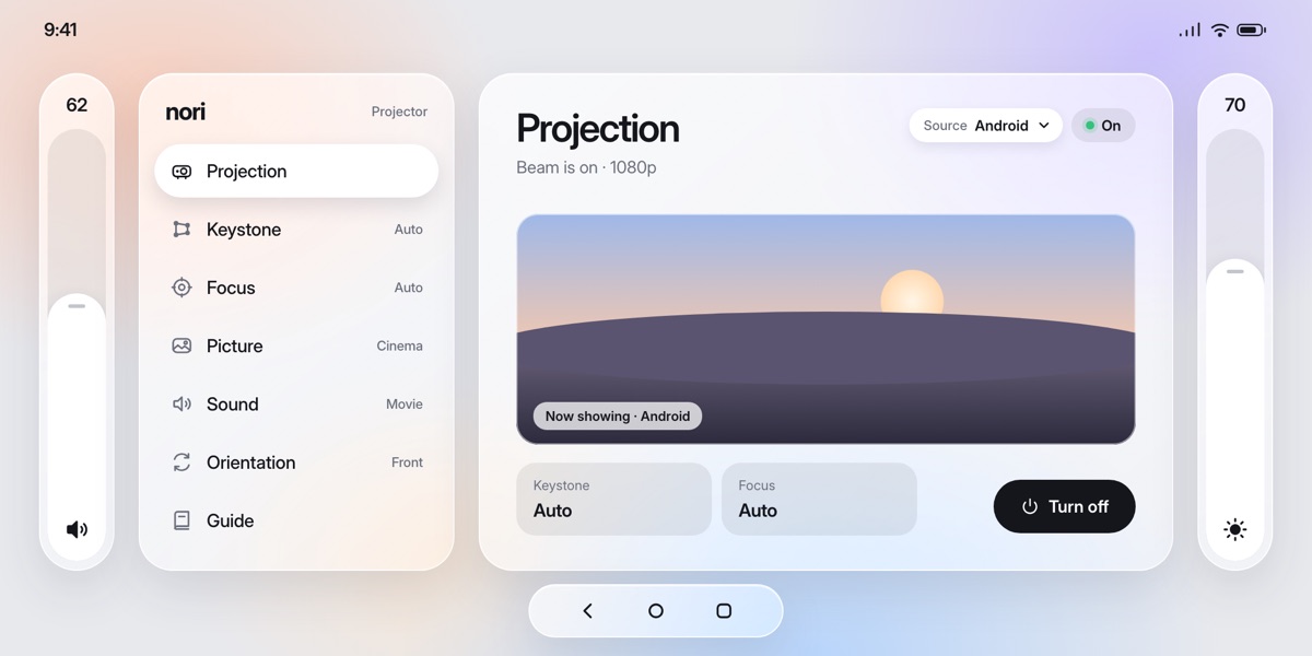
In the first version, brightness and volume sat on the home screen and keystone opened a separate full-screen page. In the final one everything lives in a single panel: the menu on the left, the controls of the selected item on the right, volume and brightness always at the edges.
Before · two screens
Now · one panel
One tap to start
With the beam off, the panel shows a single large button. Tap it and the picture comes up, while keystone and focus stay on auto. The widgets at the bottom keep their place in both states, so nothing jumps around.
A straight picture, then fine-tuning
Keystone squares the picture on its own. In manual mode you drag a corner on the touchscreen or nudge it with the arrows. The selected corner is highlighted and named, so it is always clear which one moves.
Sharp on its own, precise by hand
Auto focus keeps the picture sharp as the projector moves. In manual mode two large buttons move the lens step by step along a scale, and Reset brings it back to auto.
Presets instead of settings
Picture and sound each come as four clear presets with a short line on when to use them, instead of a wall of sliders. The current choice is shown next to the menu item, so you see it without opening anything.
Volume without looking
A three-finger swipe up or down changes the volume anywhere in the system. A large readout shows the level, so you never have to find a button in the dark.
A guided first start
A short setup walks through the first launch: language, Wi-Fi and a straight picture. It can be skipped.
Help on the device
Short step-by-step guides live right in the menu: getting a straight picture, connecting a speaker or remote, Wi-Fi and SIM, hanging the projector on a wall.
Touch, wall or remote
The same panel works by touch on the device and with a Bluetooth remote or gamepad from the sofa. Each press moves through the menu, and the controls on the right follow it.
Result
The product received a Red Dot Award: Product Design 2024. Its award description points first to an easy-to-understand interface that makes the projector usable for people who are not tech-savvy. That interface is the part our team designed.
40+Screens and states
3Designers
1Red Dot Award
Mobile app · Campus safety · 2024
LOOK
Making campus safety one swipe away
A campus safety app that keeps parents, students and teachers in one place: live location, group chats and an emergency button. Designed for a university ranked in the US top 100.
Under NDA. People, names and data in the screens are replaced.
Role
Product design, UX/UI
Year
2024
Timeline
6 weeks
Scope
80+ screens and states
How we worked
Five stages, from agreeing on goals to a polished handoff. Research came before any screen, and testing ran before the final pass.
Start
I stage
Research
II stage
UI part
III stage
Testing
IV stage
Final
V stage
User research
Audience analysis and interviews came first. Most users were first-year students around twenty, living away from home for the first time. Parents worried from a distance, an emergency call box was not always close, and class talk lived in personal social media.
“My parents worry about where I am, especially when I’m out late. I want them to feel calm, but I don’t want to be tracked all the time.”
Goals
Share location in an emergency, not around the clock
A simple check-in that gives parents peace of mind
Pain points
Constant check-ins feel like surveillance
Talking to teachers means exposing personal social media
LH
Layla HassanFreshman · 18 · UAE
“The times I felt unsafe on campus, an emergency call box wasn’t always close. That’s when I realised how exposed I’d be in a real emergency.”
Goals
Send her location for help in one move
Feel safe anywhere on campus, not only next to a call box
Pain points
No dedicated place for study group chats
Class talk is scattered across personal apps
From pain points to decisions
Each pain point from research turned into one product decision.
Untracked threat
No way to see where someone in danger is, so help comes late.
Real-time tracking
Live location on a shared map, so the right people can react at once.
Safety concerns
Feeling unsafe on campus makes students and staff anxious.
Safe environment
Parents, students and teachers in one app, with an emergency button always one swipe away.
Personal boundaries
Class chats live in personal social media, mixed with private life.
Education focus
Dedicated group chats for classes and teachers, separate from personal accounts.
Key elements
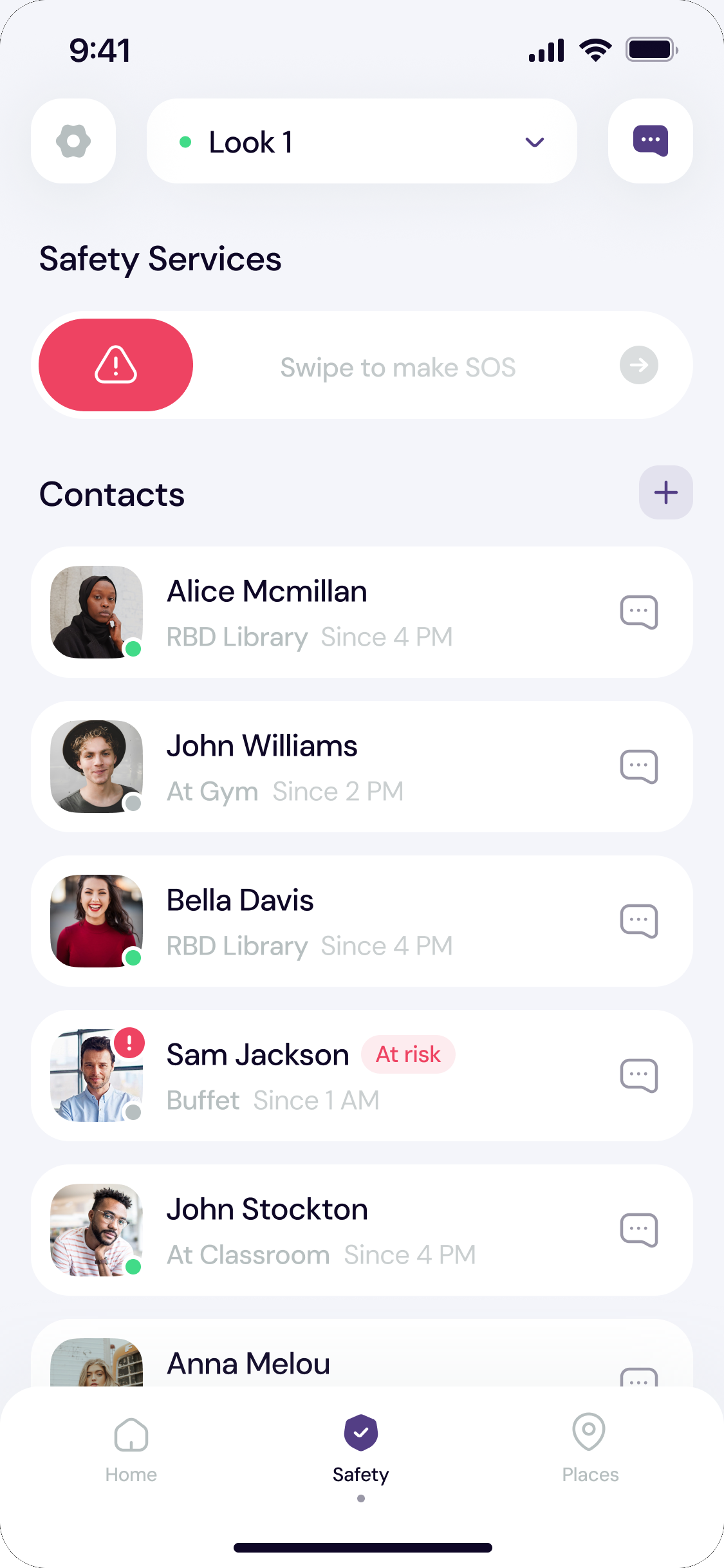
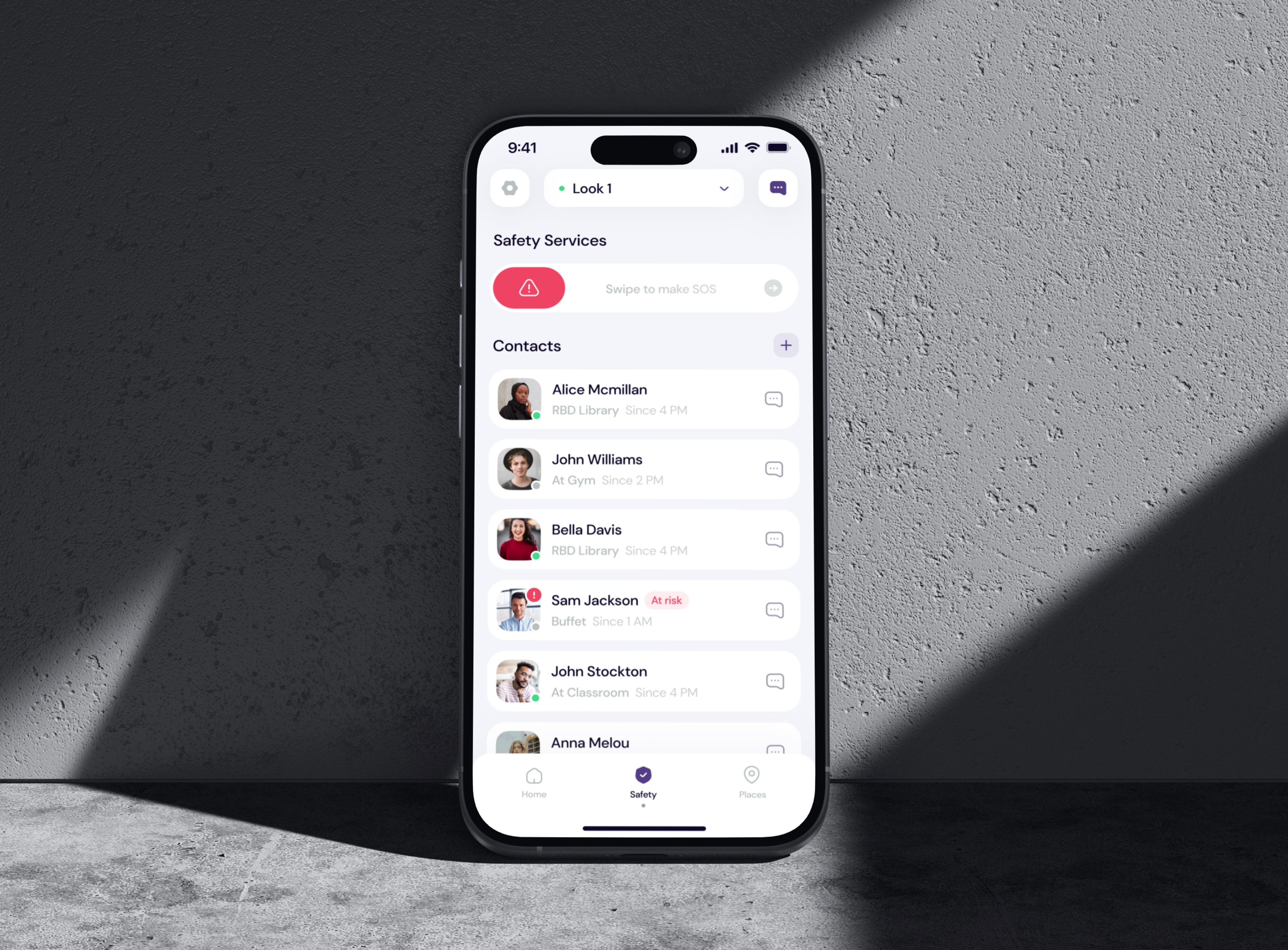
Look rests on a few things a campus really needs: an SOS button for real emergencies, a live map so parents know where their child is, groups and chats only for your university, and full control over who sees your location.
Make SOS hard to press by accident
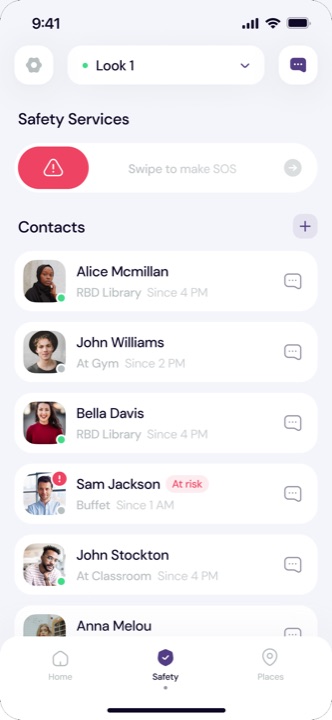
A tap button is the fastest option, but it fires in a pocket or a bag. We chose a swipe, then a 9-second countdown that anyone can cancel, then a clear active state. The cost is a few seconds before the alert goes out; the gain is that an alert always means a real emergency.
Swipe to make SOSSwipe to turn off SOS
9:41
9seconds
Activating SOS modeSOS is active
When the counter hits 0, we’ll send an alert to the Look members, your emergency contacts and local emergency services!
Emergency services are on their way! Please remain calm, ensure your safety, and provide any necessary information to responders when they arrive.
Cancel Alert
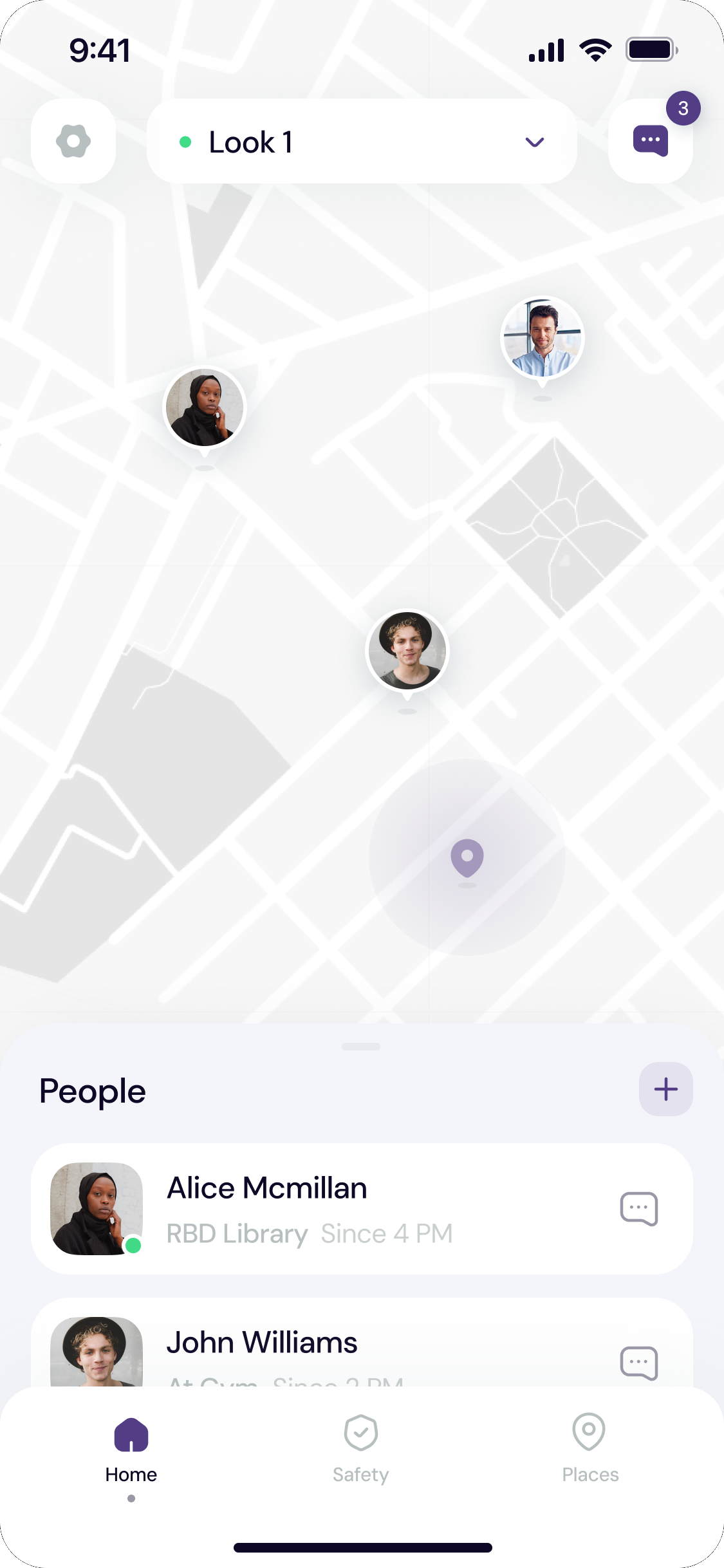
A live map of your people
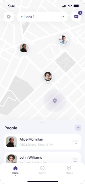
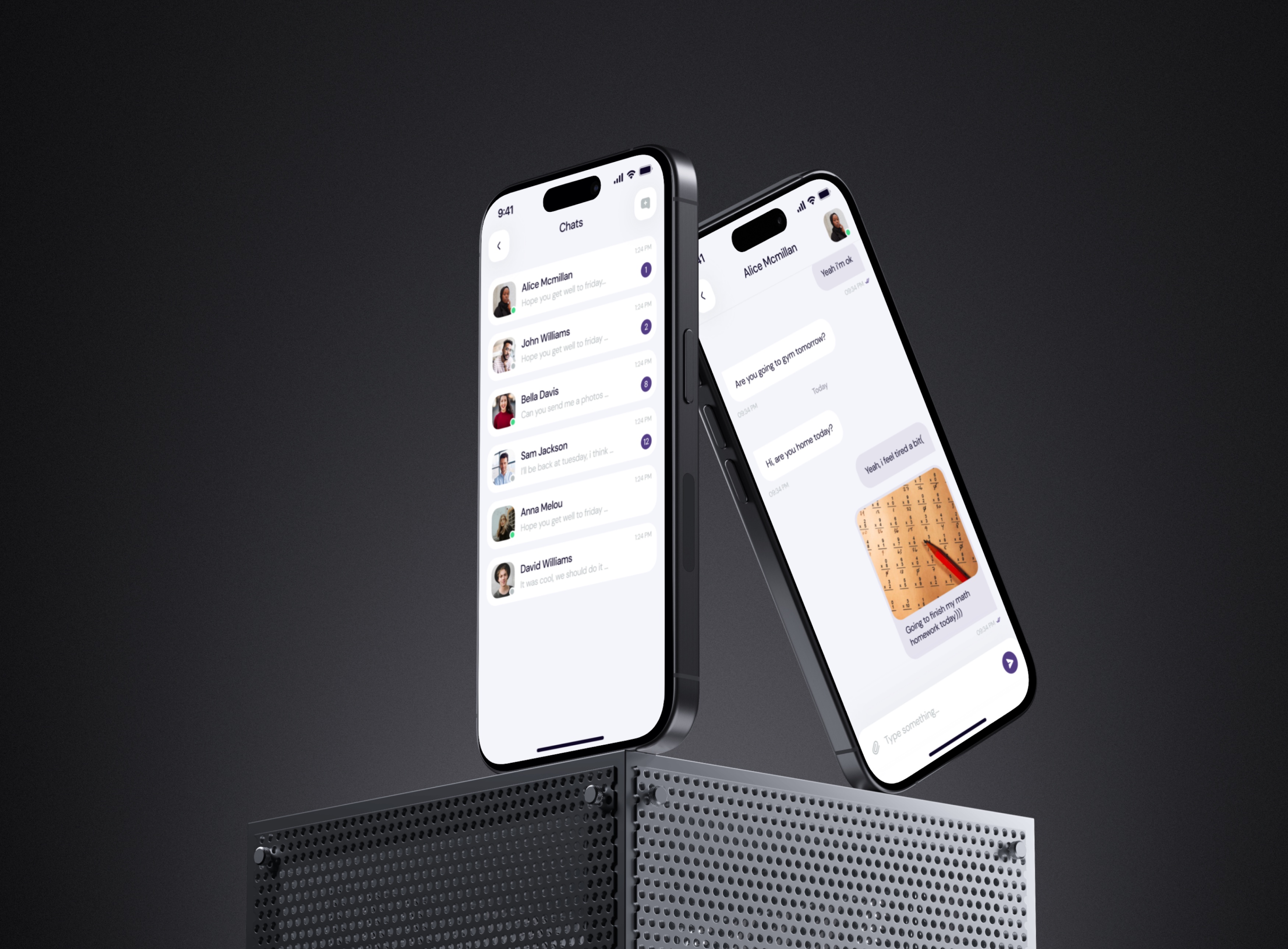
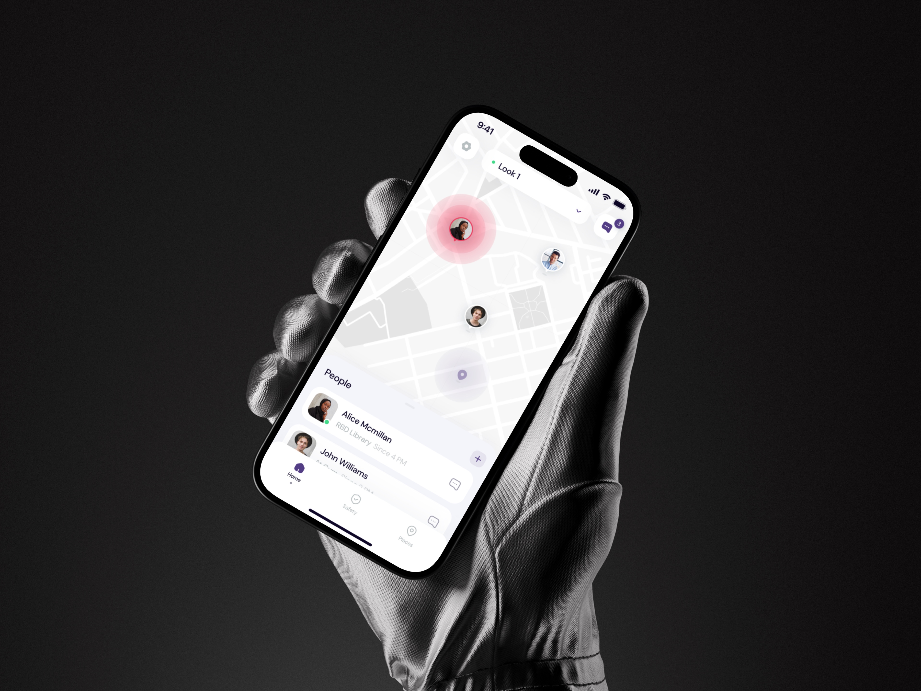
Parents see where their child is, and friends see each other, without asking. Only people in your Look groups can see you, and when you send an SOS, all of them see it at once. Arrivals at saved places come in as notifications, so nobody has to keep checking in by message.
John WilliamsArrived at RBD Library
Alice Mcmillan sent SOSTap to see her location
Groups and chats for your campus only
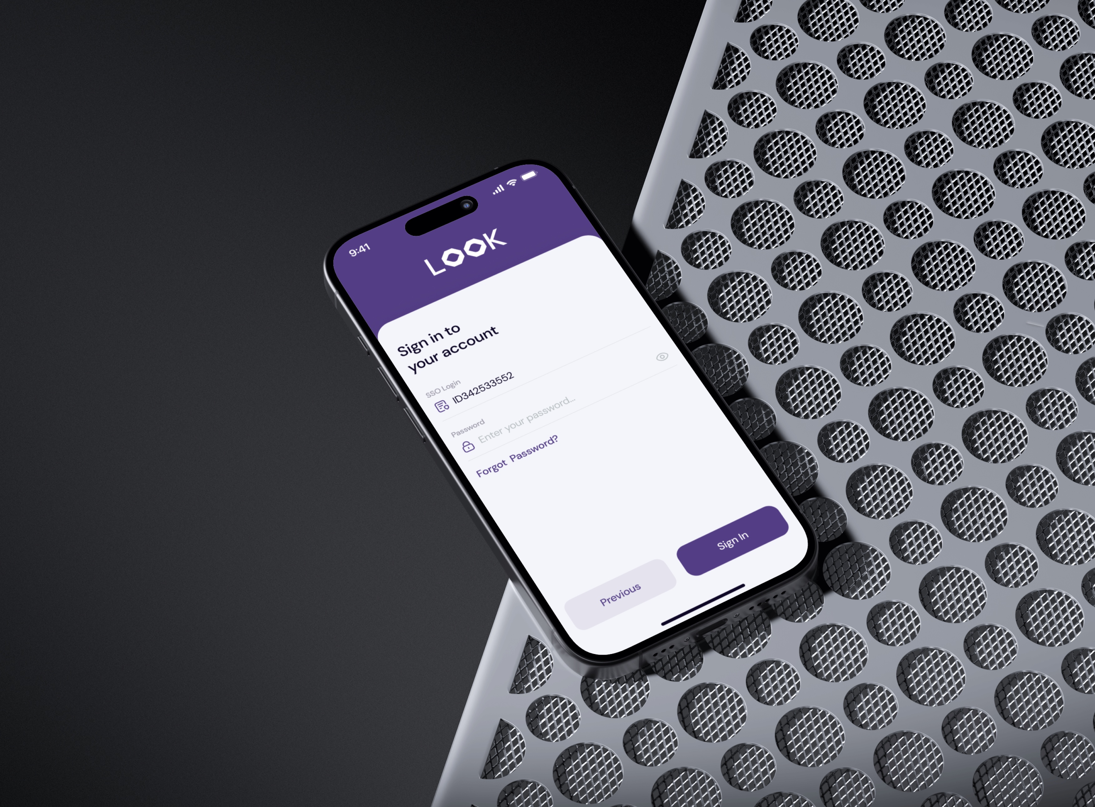
You sign in with your university SSO, then join your group with a code from its admin. Inside are your classmates and teachers and nobody else, so class talk moves out of personal social media into a place made for it.
9:41
Join Look
Enter a join code
Get a code from the admin of the group and enter it here.
Code is active for 24 hrsSend
12ABC3DEF4GHI5JKL6MNO7PQRS8TUV9WXYZ0
Your code sent successfully!
Your code has been delivered. You can see your status on Home, at the top of the page.
CancelConfirm
Clear from the first screen
Three short intro slides say what Look is for: staying connected, the campus community and keeping your people safe. Then sign-up takes a few steps with the university login.
Parents, students and teachers all connected in one app, helping create a safer campus together.Join your university groups with classmates and teachers, and keep class talk in one place.Share your location with the people you choose, and send an SOS in one swipe when it matters.Parents, students and teachers all connected in one app, helping create a safer campus together.
You choose who sees you
Groups are separate. Your location can go to your parents only, to a teacher or to your friends, and location access can be switched off in settings.
Saved places and check-ins
Places like the library or home can be saved, with alerts when someone arrives or leaves. A one-tap check-in tells your group you got there safely.
Result
One app for the whole campus: a live map, class chats, saved places with arrival alerts and an SOS that works in one swipe. Handed off with a UI kit of components and their states.
Community engagement421from ~242
More people sharing safety tips and helping each other through campus groups and real-time alerts.
Accidents~5from ~15
Faster response and live alerts for people in risky situations led to fewer accidents.
Positive reviews+25%user feedback
Users praised the app for reliability, real-time alerts and the sense of security it gives.
80+Screens and states
6Weeks
3User groups
Mobile app · Dating · 2024
Mindate
Dating built around intent, not endless swiping
A calm dating app built around a bridge between two people. I designed it end to end, from research and branding to the final interface.
Under NDA. People, names and data in the screens are replaced.
Role
Product design, UX/UI
Year
2024
Timeline
4 weeks
Scope
70+ screens and states
Design process
Four weeks, five stages. Research and interviews shaped the flows, testing checked them, and the visual design came last, on top of a structure that already worked.
1Research
Project goalsCompetitor analysisUser research
2UX design
WireframesUser map
3Testing
UX testingUser interviews
4UI design
InterfaceUI kit with states
5Presentation
Logo and branding
The mark is a bridge drawn as an M: two sides held together by one span. It is the idea of the app in a single shape, connecting two people.
Key decisions
Small interface choices that keep the app calm and quick to use.
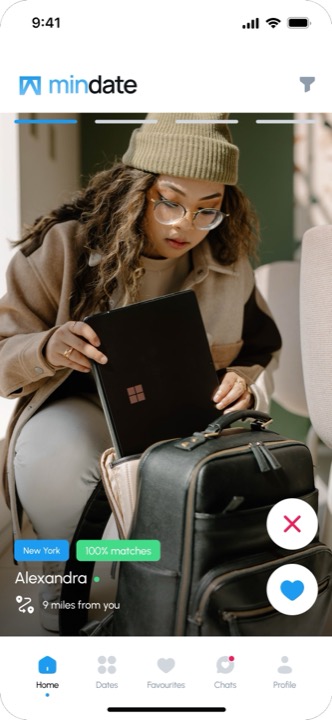
Everything to decide on one card
City, match score, online status and distance sit right on the photo, so you can decide without opening a profile.
CityMatch scoreOnline nowDistance
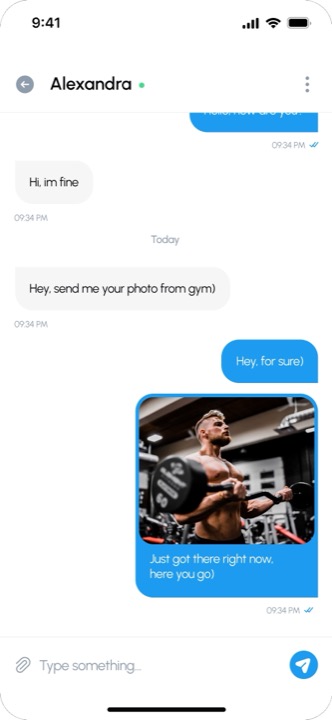
Matches and messages on one screen
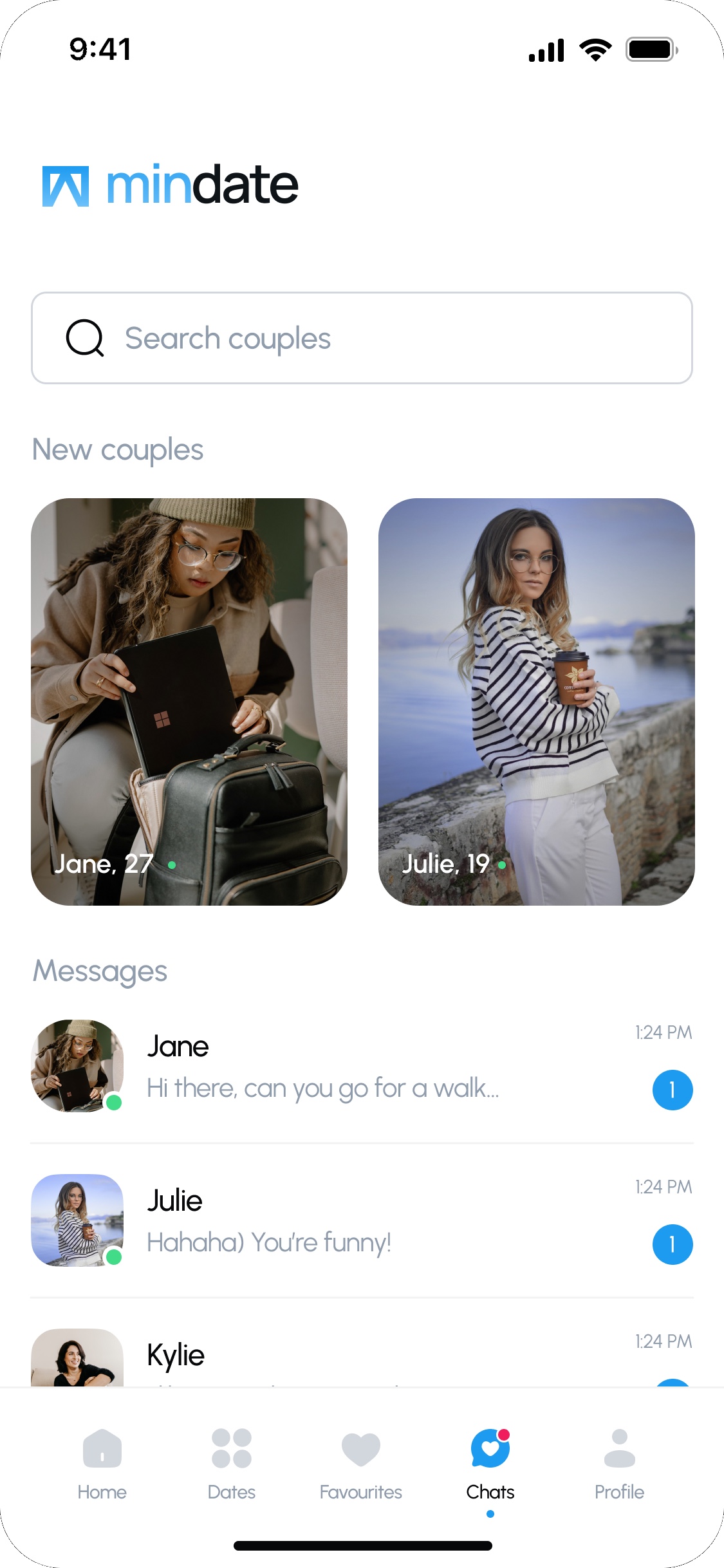
New couples sit above the conversations, with unread counts, so a new match never gets lost between tabs.
Alexandra, 26
From a match straight to a chat
The match screen offers two clear choices: keep searching or start talking. Nothing stands in between.
You have a match!
Congratulations on matching in Mindate! This could be the start of something exciting and meaningful.
Keep searchingChat
Dates built around intent
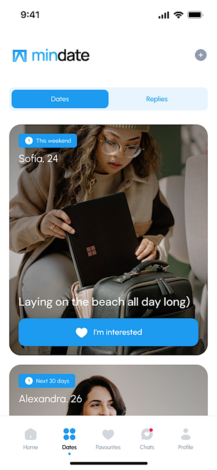
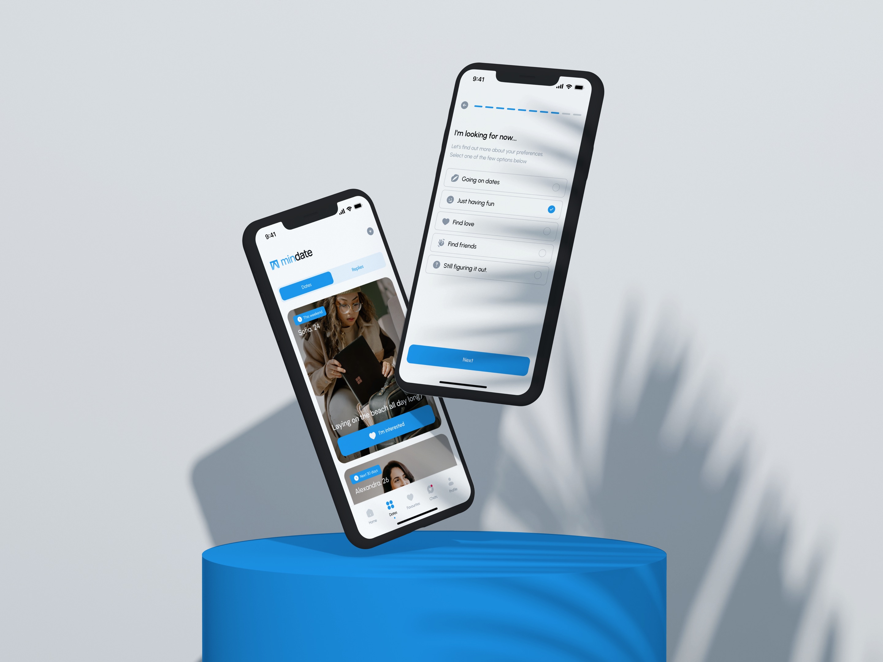
Onboarding asks what you are looking for now, and in Dates people post a plan, like this weekend at the beach. Others answer with I’m interested, so a match starts from a plan, not only from a photo.
I’m interestedInterest sent
Flexible search settings
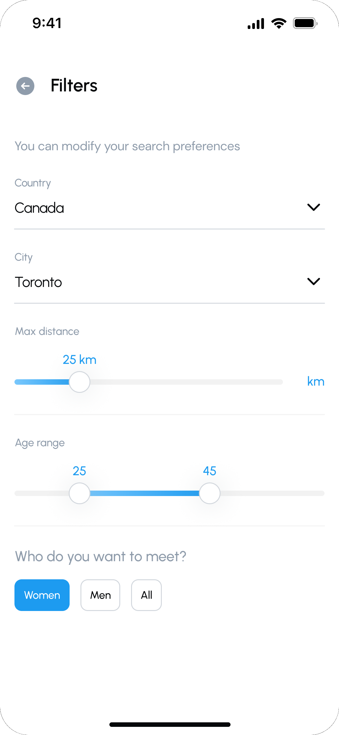
Distance and age are sliders with live values, and country and city come from a short list, so the search fits what you want right now.
25 km
2545
Result
A complete set of screens, from onboarding and profiles to matches, dates and chat, plus a UI kit with component states like errors and empty screens for the developers.
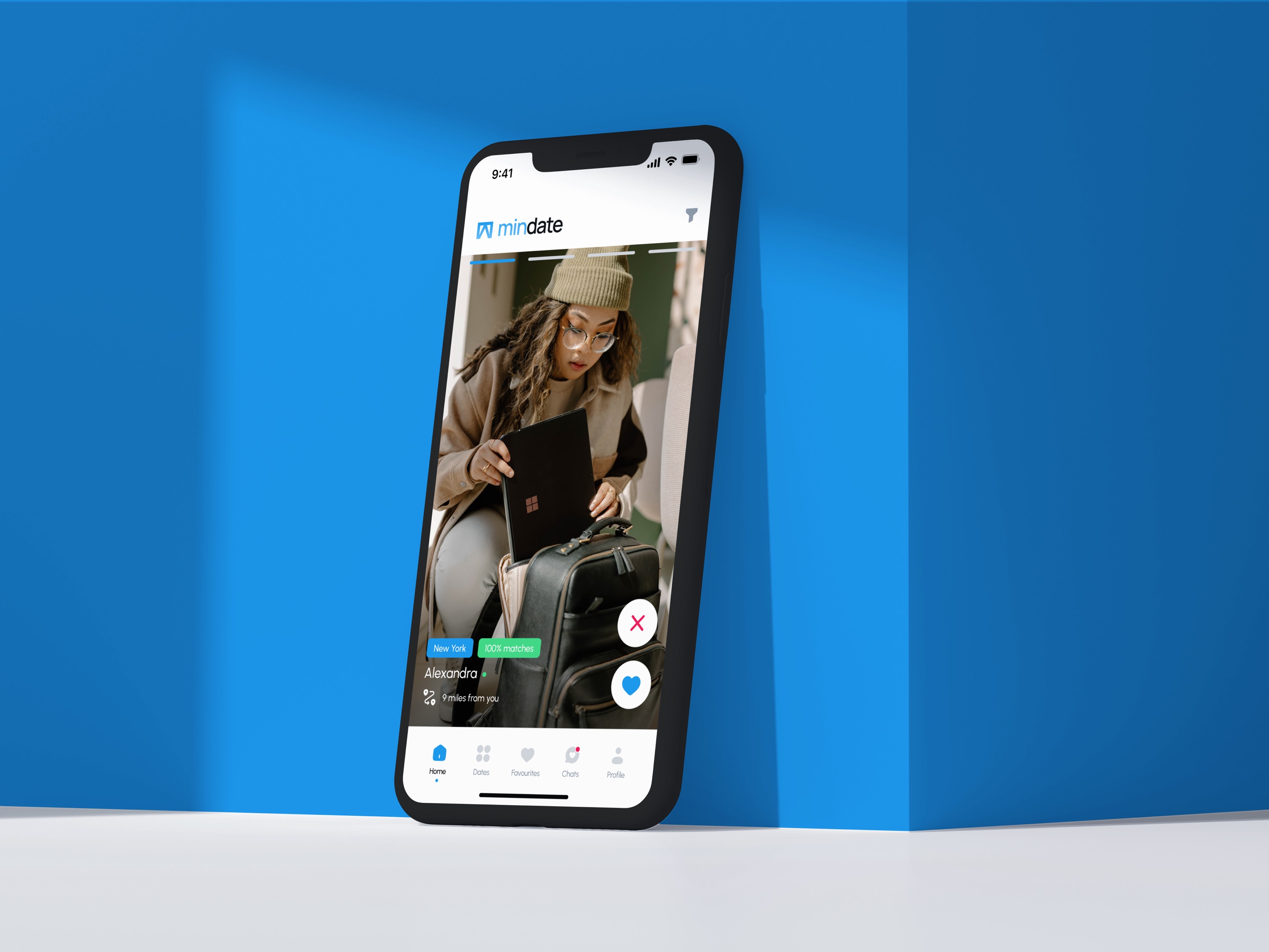
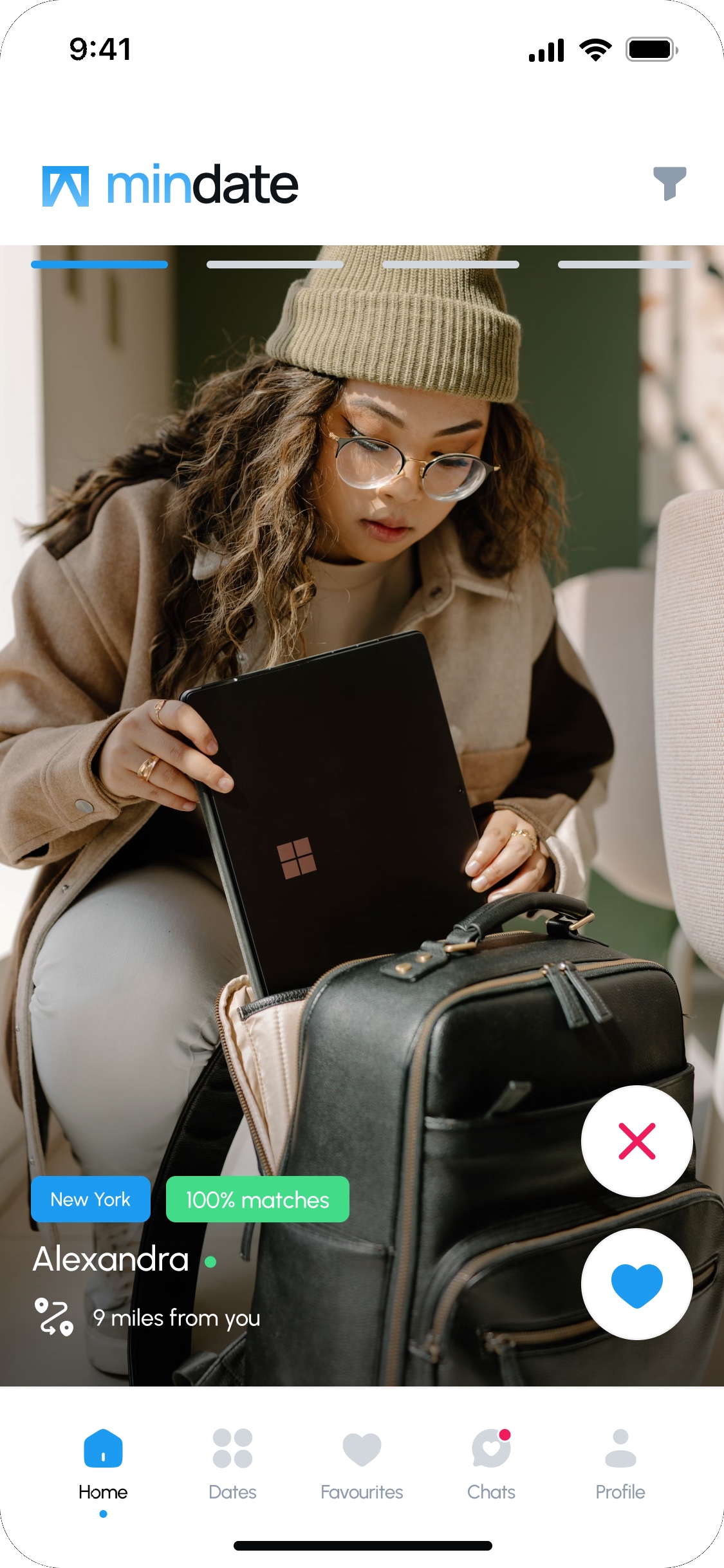 City
Match score
Online now
Distance